Timeline & Evaluation Redesign
Role
User Experience Designer
TImeline
June 2022 – Dec 2022
Team
Product Manager
Developers
Solutions Architect
Accessibility Team
Project Overview
Timeline is another section of the project redesign initiative. Timeline is a section where the managers can oversee the agents historic timeline interaction.
Evaluation is another section of the project redesign initiative. Evaluation is a section where the managers can evaluate the quality of interaction that happens between an agent and a customer.
My Contributions
User Experience Design
I started the Timeline redesign the same time I started the Search redesign for the first 2 months. However, because Search was the main priority I shifted my focus to completely design the Search section and recently started to shift back my focus on the Timeline section. After finishing off the Timeline in 6 weeks time frame, I finished the Evaluation section of the application.
Project Impact
Consolidating 10 apps that it takes to manage and coach 1 agent, seamlessly down to 1 app. The new design will save users from having to open up 2 different application to manage the agent's timeline and schedules.
Importance
More than 16k managers coach and oversee over 100k agents who serve over a million users.
Key Features
Search | Search interactions between agents and customers
Evaluation | Complete quality evaluations while reviewing interactions
Live Call & Chat Monitoring | Listen to live interactions for coaching purposes
Advisor Timeline | Gain insights into agents time distribution on the many customer interactions in a day
Current Designs
Pain Points
The words are illegible
It’s not accessible
It’s very disorganized
There are too many unlabeled buttons
First time users has no idea what to do
Not intuitive flow
Cognitive overload
Buttons do not look like actionable buttons
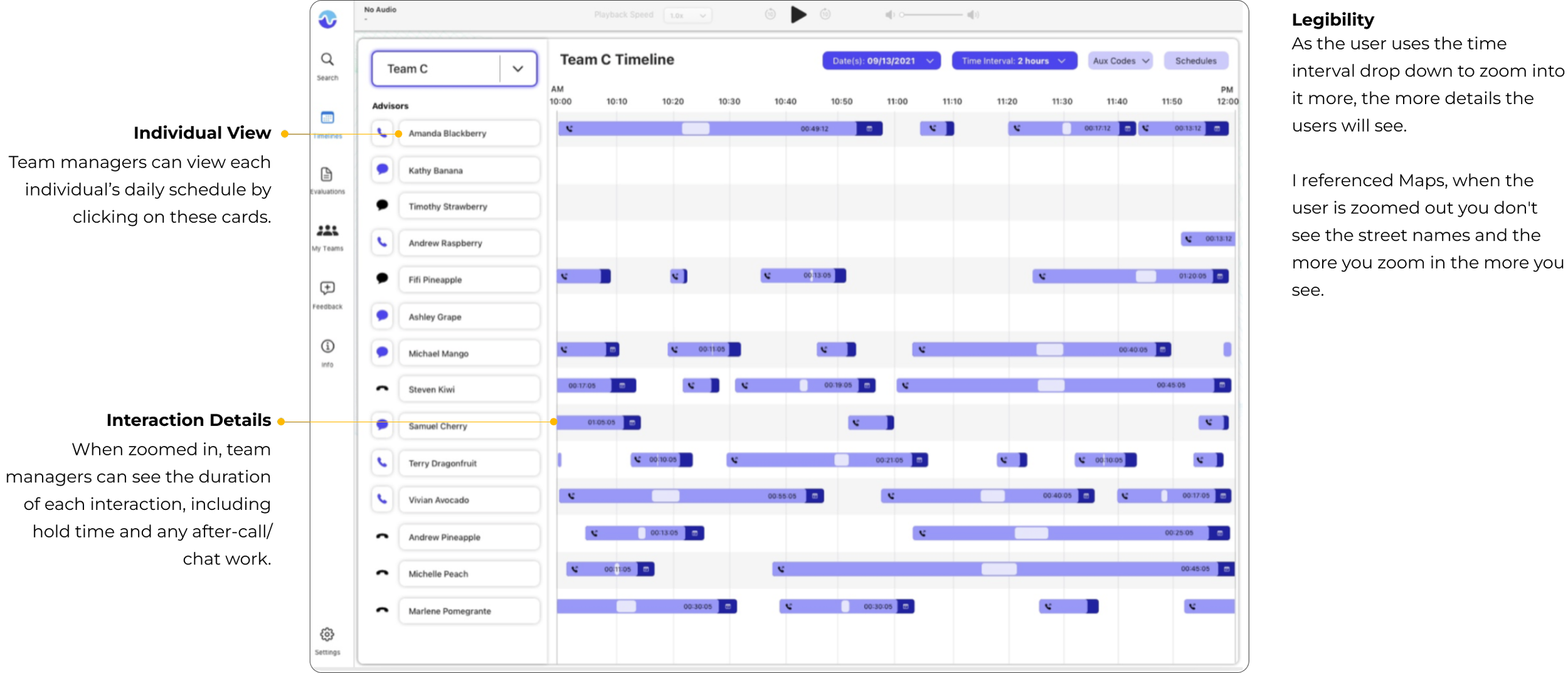
Timeline main use cases
Monitor Live Interactions (the users can monitor up to 5 Live Interactions at the same time)
Find which interactions to deep dive into
Monitoring the agents daily schedules


Part 1. Timeline
First Few Iterations

📝 Legibility
With my first take on the designs, I simply just made the timeline indicators bigger and bolder.

🤔 Unclear icons
On hover the users will get an info tooltip appear at the top so that the users are not guessing what to click on.

🎨 Aesthetic
I added different shades of purple so that it isn't too dull.

🧠 Intuitiveness
Based on requirements and usage, this individual view, that does not exist today, seems to be very helpful for most users.I put in a clear back button to take the users back to the original screen.
Feedbacks
Stakeholders
We don't hate it but don't love it.
It just still seems a little bland and still very outdated.
Team
Let's reuse the filtering system from Search for
consistency and reusability.
Second Iteration

Search Flow & Aesthetics
With my second iteration, I brought in the search filter pills for consistency.

Problems
Accessibility complications with the white on faint colors.
Legibility
Unclear visual hierarchy
Final Iteration


Part 2. Evaluation Designs
Current Design

Pain Points:
It’s not accessible
It’s very disorganized
There are too many unlabeled buttons
First time users has no idea what to do
Not intuitive flow
Immediate CTA are hidden
Everything is hidden in right click menu
Cognitive overflow
Evaluation main use cases
Evaluate interactions between agent and customer for quality standards
Place markers in timestamps to mark specifically where the agent needs improvement

Constraints & Challenges
Technical Constraint
The blue form cannot be resized or moved. It is rendered from another web app and cannot be changed.
Challenges
Limited real estate, form taking up 70% of the screen
Utilizing the limited remaining screen space
Final Iteration


Metrics and Successes
Created a lasting partnership with AppleCare Team to provide them with the products that enables exceptional Customer Care.
With this all-stop-shop experience, our team deprecated 5 products and was replaced by this one by 2025 which will save our team a lot of money and resources.
“This new interface makes a lot more sense to me”
“I love that I don’t have to use 3 different products to evaluate my Advisors”